Campaign · Norton Abrasives · Saint-Gobain North America
Pass The Rock
An industrial brand in a palette it had never used.
Role
Digital Designer; owner of the campaign's visual system
Timeline
Concepting March 2021, first post June 7, final post September 2021
Scope
Organic social for Norton's thin wheel line — Facebook and Instagram, North America, with video on YouTube
Outcome
Five recurring formats shipped inside one visual system over a four-month run
The Situation
Marketing to People Who Don't Read Marketing
Norton's thin wheels are the cut-off, grinding, and combination wheels that mount on an angle grinder. Consumables, bought by the box, used until they're gone. The people buying them are welders, fabricators, and metalworkers, and they are not an audience that arrives at a brand page hoping to be persuaded.
The product managers came to us with the ask — push the thin wheel line on social — and what they didn't bring was a format. That's an unusual amount of room, and it meant the first real work wasn't design. It was finding a way in.
The assignment was a question, not a request.
Authorship
My Role
I was a Digital Designer at Norton Abrasives. The product managers were the originating stakeholders; I worked alongside them, the marketing group, and our video manager.
Concepting was genuinely shared. Several people were pushing several themes — movement and sharing, the basketball reading, the period direction — and the concept that survived was the one where those converged rather than one person's idea winning. What I owned outright was the visual system: art direction, logo, templates, photo treatment, and every static asset that ran. Once the direction was set, it became the tone the video work was built on.
The Search
Five Doors
I built moodboards around several territories, each with its own tagline and visual logic: All Bite. No Bark. — Bonded Under the Hood — Grinders Almighty — Cut. Grind. Next. — Pass The Rock.
Grinders Almighty went first. It took the grinder-as-deity idea literally, Olympus and all, and the appeal was that it put the power in the hands of the person running the tool. The problem was in the name. It spoke to grinding, and the line it was meant to sell is half cut-off wheels. A concept that flatters one half of your catalog and ignores the other doesn't survive its first read. It was also the most out-there idea in the set, which left it the least margin once that objection landed.
Bonded Under the Hood went furthest in the traditional register. The idea was brotherhood: drop the hood and it doesn't matter who you are, what you look like, or whether the trade expected you — you're in the same work, in the same shop, doing the same thing. Grunge textures, ecclesiastical type, black-and-white portraiture carrying most of the weight. It was the most serious thing in the set, and it was recognizably a Norton campaign.
Pass The Rock came out of the field. On the job, people don't ask for a thin wheel. They ask for a rock. The word carries transfer and motion, it belongs to the people using the product rather than the people selling it, and the basketball reading arrives free with it.
The name belonged to the people using the product, not the people selling it.

The Art Direction
The Argument for Not Looking Like Ourselves
I pitched a muted 1970s palette against the direction I'd already built for Bonded Under the Hood — warm ochres and rusts, geometric arcs, floral decals, a flowing script tying it together, in place of grunge and monochrome. The case had four parts and only one of them was taste. The period gave us room to expand. It gave us permission to be funny. It caught a retro wave that was already moving. And it opened up colors and styles Norton had no history with.
That last one did the most work. I argued for the period direction over the concept I'd developed furthest, because Bonded Under the Hood was the safer and more familiar version of us, and Pass The Rock only worked if it didn't look like us. A campaign built on a word our customers used, in a visual language our customers had never seen us speak.
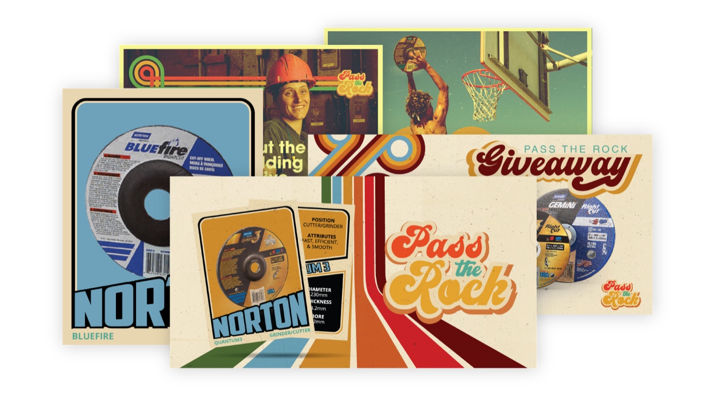
The system had to hold five content formats and a video adaptation without being rebuilt each time, so I built components rather than layouts: the arc motif, the decal set, the script lockup, a photo treatment of film grain, dust, and a pushed yellow-green grade, and the logo. Everything downstream is those pieces rearranged.

Both directions.
The photography ran in both directions, which is the part I'd point to. Wheels were composited into playground shots — a mid-air dunk thrown down with a Quantum 3 instead of a ball. And basketballs were composited into jobsite shots: a pipeline welder with his hood pushed back and a ball tucked under his arm like he'd just come off the court. Both swaps are absurd. That was the point, and it's the humor the period direction was chosen to make room for.
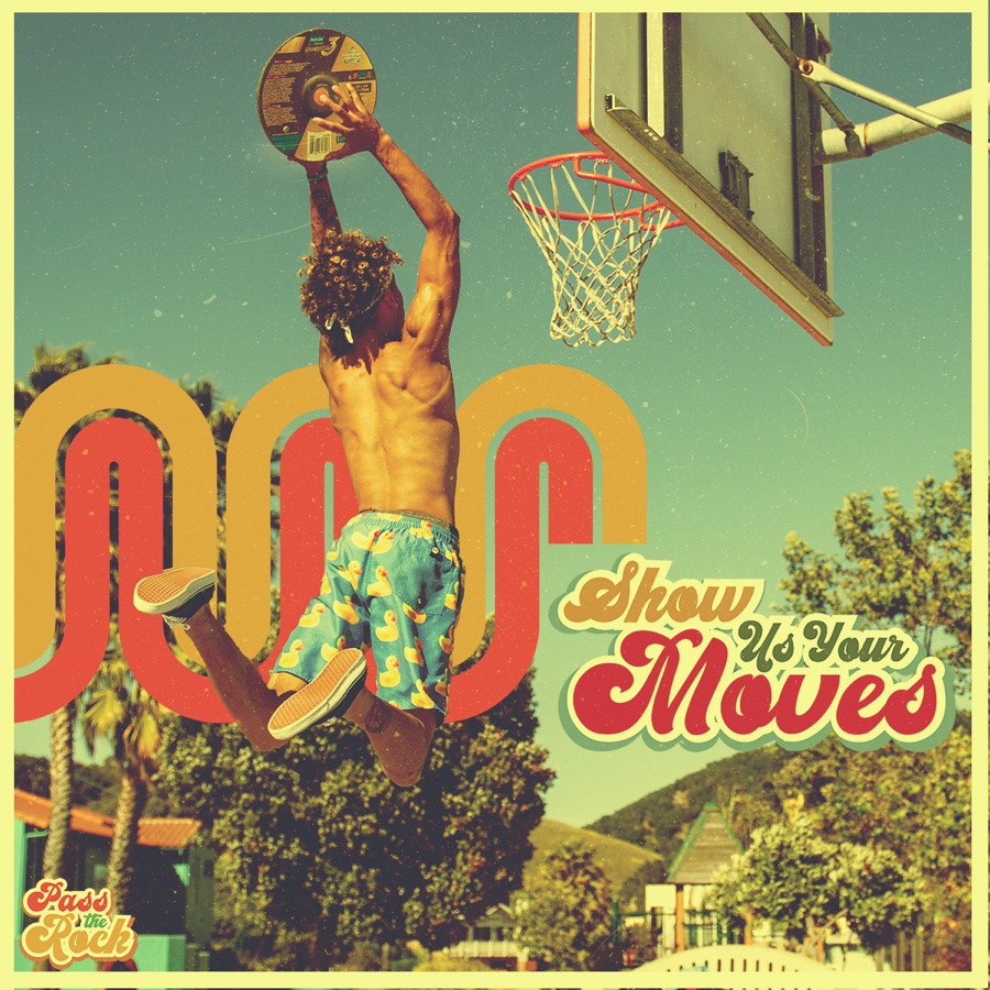
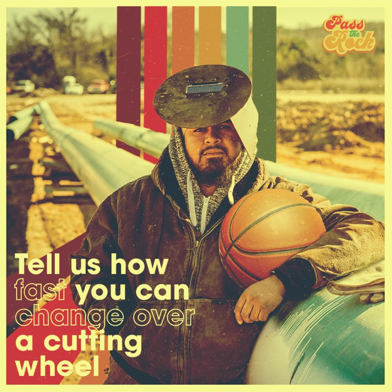
Both halves of the joke had to travel, or it was just a basketball ad with wheels in it.
The Formats
Five Formats, One Verb
Rather than run one message for four months, we ran recurring formats. The first one out was the one that took the name literally.
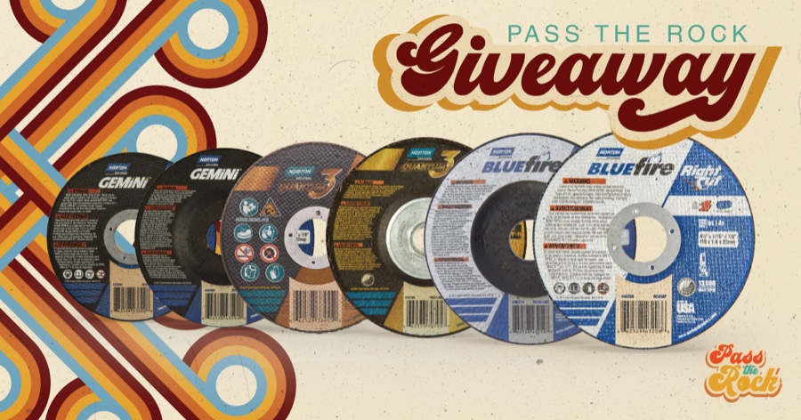
Giveaway.
Giveaway made the audience perform the campaign. Entry ran on tagging the person you wanted to win with, plus naming your favorite Norton grinding or cutting wheel — so a single post moved the product toward two people and got both of them saying a product name out loud. The mechanic is the concept. Everything else in the campaign is about passing the rock; this is the format where somebody actually did.

All Stars.
All Stars put products on 1970s basketball trading cards. This is the one I'd defend hardest, because the joke needed almost no invention. Spec data already reads as a stat line: the internal Good/Better/Best tier became TIER, the year a wheel was released became DRAFTED, and the wheel types it comes in became POSITION. That isn't a gag, it's the data sheet with different labels.
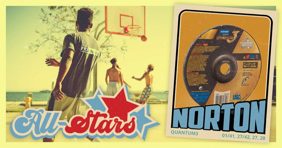
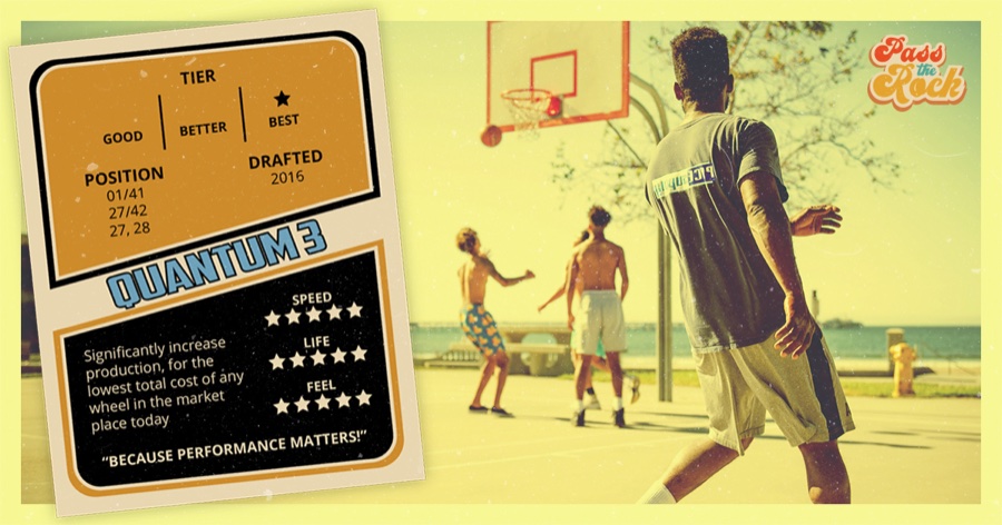
The star ratings for Speed, Life, and Feel were the invented layer, and they were what got reviewed. I kept them directional and internally consistent — the premium wheel rates five across, everything else falls in beneath it — rather than implying measurement we hadn't done. In a category where performance claims are regulated, that's a line worth drawing on purpose. The printed spec stayed hard, the flavor stayed obviously soft.
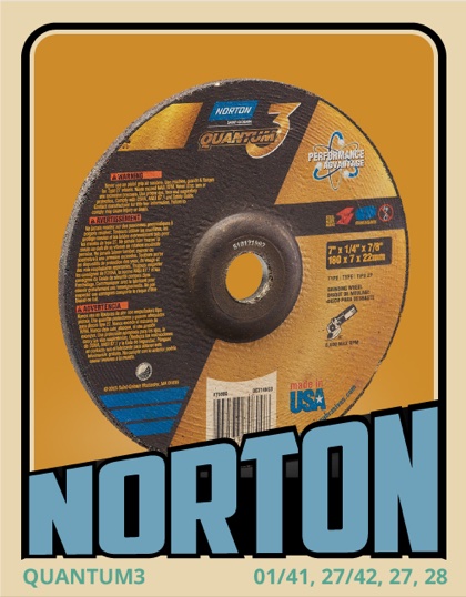
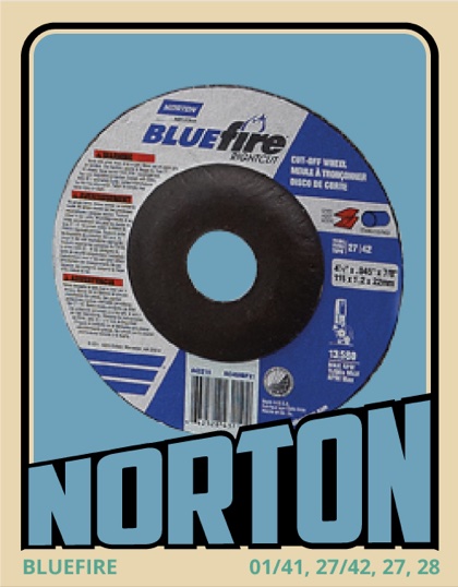
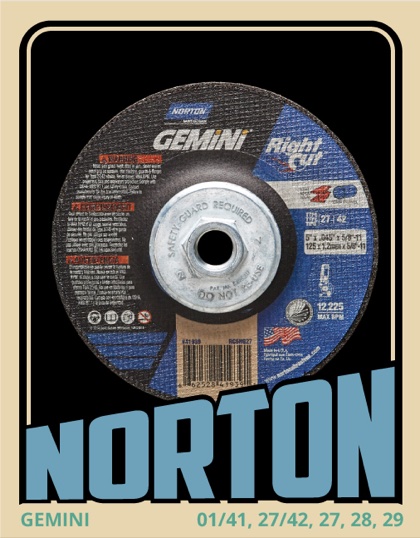
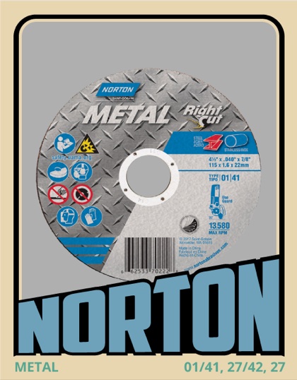
The trading card didn't need invented stats. The spec sheet was already a stat line.
Show Us Your Moves.
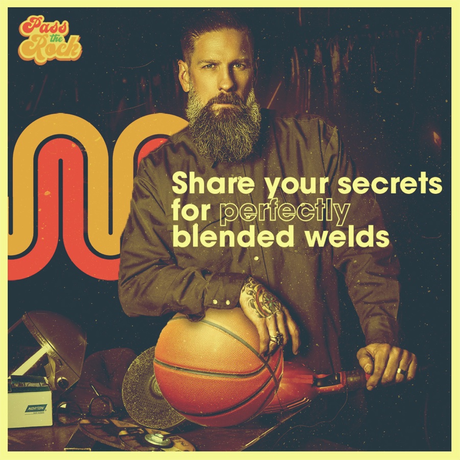
Show Us Your Moves was the participation set — direct prompts inviting people to share technique, workarounds, and jobs they'd saved. A few executions carried the format's own lockup; most just carried the question over the photography, with the campaign logo in the corner doing the identifying. The lockup version is the dunk shown further up — it belongs to this set as much as it does to the art direction.
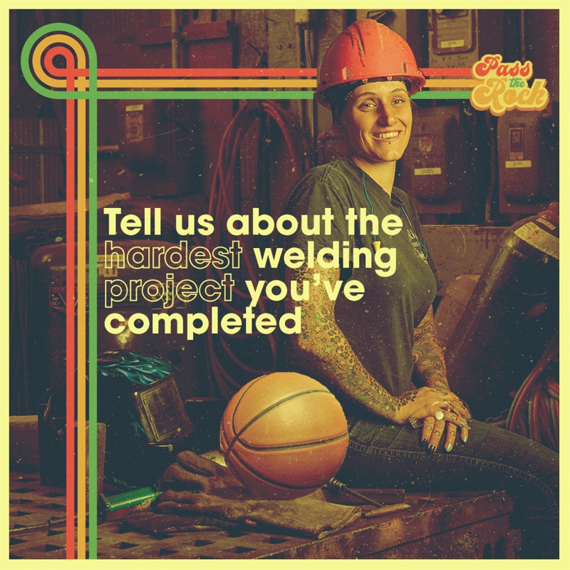
Technical Fouls.
Technical Fouls was spot-the-difference, with the differences usually being a missing product or missing safety gear. Depicting absent PPE on a brand channel is a real hazard, so the rule was that nothing unsafe is ever shown in operation. Gloves go missing from a table, not from a hand. Where the difference had to involve gear in use, it was a logo removed from a glove rather than the glove removed from the person.
Training Camp.
Training Camp was the straight one — how-to video and best-practice graphics, in the same system, so instruction didn't show up looking like a different brand.
What Shipped
Five recurring formats, one component system.
The campaign ran organically on Facebook and Instagram from June 7 through September 2021, with video on YouTube. Five recurring formats, one component system, a logo, and a photo treatment that held across static and motion without being rebuilt for either.
It was also approved as a platform rather than a run. None of it was picked up.
In Hindsight
What I'd Do Differently
I stacked three concepts and gave myself no rule for combining them.
The work asks a viewer to hold an abrasive product, a basketball metaphor, and a 1970s period cue. When those align, it's the best thing I made that year. When they don't, they compete. The fix isn't fewer layers — it's that not every asset needed all three, and I never decided which combinations went where. The giveaway post is product and period with no basketball anywhere near it, and it's the cleanest thing in the set. The dunk carries all three and works the hardest for it. One of those was a decision and the other was a default, and I couldn't have told you at the time which was which.
Awareness was the goal, and I left no way to see it.
This was never a clicks-and-likes brief. It was awareness for a consumable product line with sales somewhere downstream, and in B2B that chain is genuinely hard to prove. Which is exactly the argument for instrumenting something before launch rather than after. I didn't request it, there was no post-campaign checkpoint, and that's why this study contains no performance claims. Not discretion — absence.
I built a platform and didn't leave the kit for it.
The concept was chosen partly because it had room to grow, and a roadmap for growing it existed on paper. What didn't exist was a documented system anyone could pick up cold — no component library, no template set, no written rules for the photo treatment, the type, or which layers belong together. Formats from this campaign still get referenced internally, the trading cards as an experiential idea, the spot-the-difference mechanic as an engagement device, but conversation isn't continuation. A visual system that lives in one designer's files ends when that designer moves to the next project.
The Takeaway
What It Taught Me
The thing that cracked this campaign open was a word, and the word didn't come from marketing. It came from people who talk to customers for a living. I've kept going back to that: the fastest way through a positioning problem is usually to find out what the people using the thing already call it, and then stop writing.
The art direction lesson took longer to see. What made the period direction right wasn't that it looked good, though it did. It was that it had more give than anything else on the table — more colors, more tones, more room for a joke, more places to go next. Elasticity is the property I look for first in a visual system now, ahead of how the first execution looks.
The catch is that elasticity is only worth something if you stretch it in one direction at a time. I had a system that could go almost anywhere, and I took it everywhere at once.
In Motion
The Campaign Video
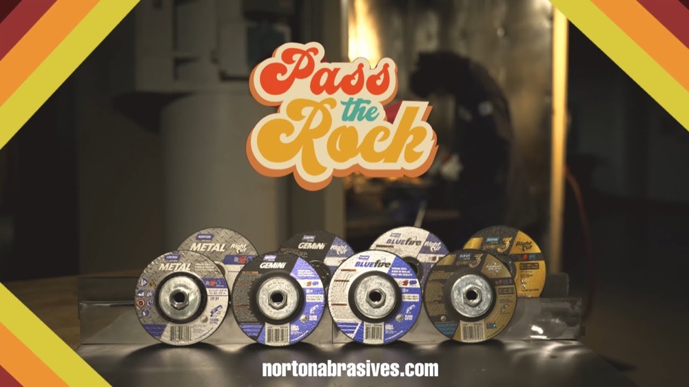
I did not direct or produce this video. It was directed and produced by our video manager. What it is built on — the concept, the palette, the script lockup, the photo treatment, and the All-Stars format — is the system I developed, and this is the clearest record of that direction in motion.
It is here because the passing sequence does something no static asset could.