Enterprise Web · Norton Abrasives · Saint-Gobain North America
It's a Lot of Gray
What you can change from inside a system you don't control.
Role
Web Designer throughout. The only in-house digital designer, present from the first page to launch and after it.
Timeline
Joined fall 2019. Page work 2019–2022. Rebuild kickoff February 2023, launch July 17, 2024.
Scope
Norton Abrasives' global web presence — roughly 26 country and language sites, North America leading
Outcome
Live. The dark blue I argued for in 2019 survived a full rebuild and still anchors the site. The launch templates were carried to a sister brand.
The Situation
The Sentence That Started It
"It's a lot of gray."
That was the assessment of the website when I joined in the fall of 2019, and it was accurate. Gray fields behind gray cards behind gray photography. But the neutrals weren't the whole problem. Norton's blue was a light, bright blue, and against a light background it sat at nearly the same value as everything around it. A brand color that can't hold a page reads as more gray.
Underneath that was a platform problem. The site ran on Drupal 7, already superseded by the time I arrived. A rebuild was years away and not yet funded. What existed was the site we had and a brief to make it better inside it.
The contrast problem wasn't a taste problem. The brand color couldn't hold a page.
Authorship
My Role
Web Designer at Norton Abrasives, part of Saint-Gobain. The title didn't change across any of what follows. The posture did, three times.
The core team was three. My manager owned the platform relationship and the business requirements, including back-end systems and product data. A digital marketing specialist owned taxonomy, ticketing, and content structure. I owned design: UX, interface, brand translation to digital, and — in the first phase — the front-end code that made it real. For decisions with consequences past the website, we brought in the side of the business that had held Norton's brand standards for years in print.
The scope of that ownership shifts across the three phases below, and it's worth stating once. I built the first site's pages outright. I did not build the system that replaced them; on the rebuild I was one of several voices on what it should contain, working alongside two outside partners. What stayed mine throughout was the design of the pages themselves and how the brand behaved once it became a screen.
I was the only digital designer in the building for all of it.
Phase One, 2019–2022
The CMS Was the Design Constraint
I was hired to raise the site's visual standard inside the system we already had, and to give the team a way to change pages without a development ticket for every change. In practice: I designed the page, wrote the HTML and CSS, produced the graphics, placed the content. Landing pages, market pages, contact, the homepage. New sections that hadn't existed — Partnerships, Articles.
Every decision ran through one question first. Can this be built inside the constraints. No JavaScript. Only markup the CMS would accept, and it silently filtered terms it didn't like, so techniques that work anywhere else would vanish on save. Custom components down to the buttons, because the system's buttons were part of the problem.
That sounds like a limitation on design. It functioned as the brief. If the answer was yes, everything after it was a design decision.
The header.
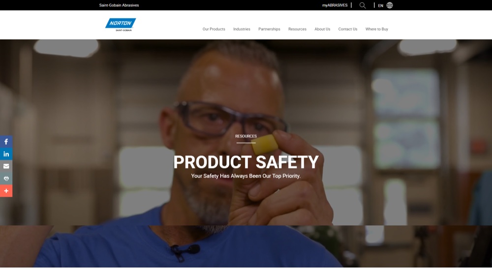
I built the first one for the homepage: a full-bleed video hero with a legible text overlay, reflowing at every width, no JavaScript, in markup that had to survive the filter. It took long enough that I questioned more than once whether it was worth the trouble.
The content settled that. The homepage footage moves through people working and carries the logo through the cut. The Safety version, which I built after by carrying the same technique over, shows someone putting on protective equipment piece by piece. A still image can tell you a grinder wears a face shield. It can't show you the order, or that someone bothered to put it on properly. Motion wasn't decoration on those pages; it was the argument.
Once one existed, it became the site's vocabulary for how a page opens.
The two cards.
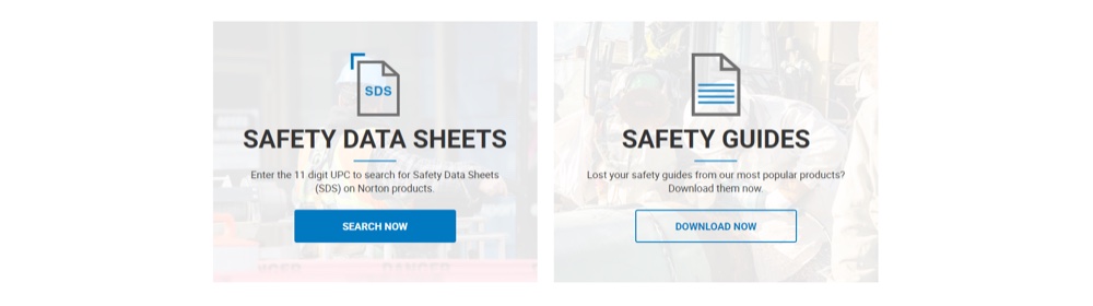
The Safety page's most-requested items were known: safety data sheets and safety guides. Rather than leave them in a list with everything else, I gave each a card directly under the hero, at equal weight, above all other content.
I spent the top of the page on two known tasks instead of a fuller content shelf, because the request data pointed at two things and the old layout had answered by showing everything at once. The page now opens by doing the two jobs people came for.
The blue.
The contrast problem needed an answer, not a complaint, and this is where it starts. I proposed a midnight blue — dark enough to hold a full-bleed field, dark enough to carry white text without a scrim, dark enough to give the existing Norton blue something to sit against instead of dissolving into it.
It wasn't in the brand system. I pushed for it and started using it internally first, and from there it graduated to external pages, one at a time. It took years to move from something I was arguing for to something nobody had to argue for any more. It comes back at the end of this study, because it kept going after everything else here stopped.
These pages improved on what preceded them and they aren't my strongest work; the ceiling was low and so was my seniority. What matters is that the site's visual standard moved several years before the budget did, and the rebuild inherited a demonstrated position instead of a wish list.
The constraint wasn't what I could design. It was what I could get past the filter.

Everything on the shelf at once, and no answer to why you came.

Video hero, then the two tasks the request data pointed at.

The same opening structure, now built from components.
Phase One, continued
The Question at the Top of the Page
Three versions of the homepage, three answers to one question: what does this page lead with?
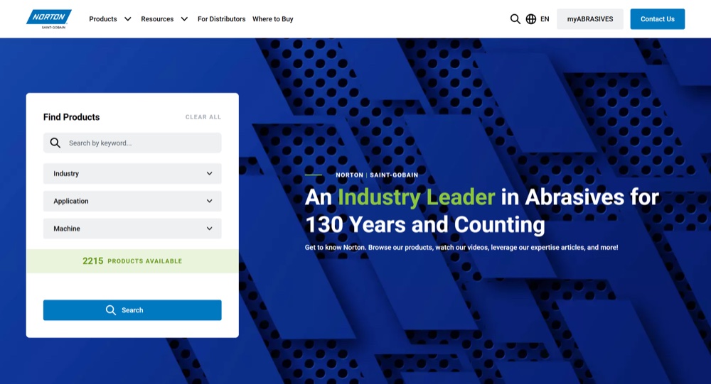
Before. The hero was given to a promotion asking visitors to follow the brand on LinkedIn, floating over stock machinery. Product search sat below it as four unstyled dropdowns in a bordered box. The most valuable position on the site was spent on a social follow.
Mine. I gave the hero to a brand statement with real contrast for the first time, and gave featured products a card treatment instead of a flat row. Part of what I was doing in these years was simply dragging the site into its own decade — depth, motion, type that wasn't centered by default, photography at a size worth looking at. Search stayed where it was, mid-page.
Now. The product filter sits inside the hero as a persistent card, on the pattern, returning a live count as you narrow it.

The best position on the site, spent on a social follow.

Contrast solved. Search still sitting mid-page.

The filter moved into the hero, with a live count.
The tool the page exists to offer became the first thing on the page.
Phase Two, 2023–2024
Advising, Then Building Every Page
We kicked off the rebuild in February 2023: Drupal 7 to Drupal 10, plus an overhaul of the systems feeding the site. We worked with two outside partners, one for research and UX/UI, one for development.
What arrived at handoff was a component library and a skeleton — a handful of built pages and the parts to make the rest. Our team built the site. I built most of the landing pages, and I built them by pushing components past what they were scoped to do, because the library alone couldn't produce the layouts we needed. That forcing is where most of my design work in this phase lives, and it's also what told me exactly where the system was thin.
One honest note on the shape of the year before that. I was one of several voices arguing which components the site needed and which it didn't, and I reviewed at every stage — information gathering, low-fidelity UX, high-fidelity files, then QA on components and page types before launch. We held final say and used it sparingly. We were paying for expertise across the whole platform, not just design, and overruling it on instinct would have defeated the point.
Brand, translated.
There were two brand voices on this project. One held the logo and the print standards, and had held them for years. My domain was the translation — what the system means once it becomes components, spacing, and color at global scale. We questioned each other's calls and adjusted in both directions.
Two of those decisions are visible on the live site.
The first is the pattern behind the homepage filter, at the top of this page. It wasn't in the brand standards; it didn't exist before this project. I argued to keep it on the grounds that it carried the logo's iconography inside its geometry and read with the industrial tone the brand's messaging claims. Arguing from the spirit of a brand system against the letter of it is a position you have to be able to defend, and that was the defense. It shipped, and it now anchors the top of the site.
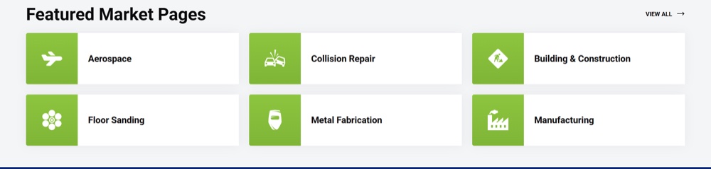
The second is the green. I can't claim its origin. I pushed for it to appear consistently across the new site, and we settled it as a reserved accent rather than a field color — no green banners. On the current homepage it appears in one word of the headline and in the market tiles, nowhere at scale. The restraint was the decision.
Twenty-six sites, one system.
Every region was invited into the process. A handful took an active part; others didn't have the team for it, or were content to inherit. North America was positioned to lead and to codify what got decided.
That shaped the work more than the page count suggests. Components were filtered toward what would be most universally useful rather than what served one market best, and the CMS side was weighted for editors who aren't designers, because most of the people using this system wouldn't be.
The clearest case was the top of the homepage. We wanted the product filter there, on the pattern. Other regions wanted a full-width image instead. That isn't a layout preference — it's a disagreement about whether a homepage hero belongs to the brand or to the task, and both positions were defensible for the markets making them.
We made both valid components at the top of the homepage rather than mandating ours, which cost a single consistent front door and bought a system 26 regions could actually use. Our region kept the filter. Others got their image. A global platform that only works for the region writing the spec isn't one.
Everyone was invited. A handful showed up. We codified what got decided.
Phase Three, Post-Launch
What the Bending Exposed
The site launched July 17, 2024. During QA and page building I had repeatedly forced components past their scope to fit design or content needs, and that told me precisely where the library was thin. After launch I turned it into specifications for development.
Some were new capabilities: animation support, a built-in icon library. Some were repairs — spacing between components, image quality handling, and a set of fixes to the featured product grid, where character limits, image padding, and spacing together were keeping it from holding the range of content regions actually needed to put in it.
They're specified and queued. Several are still there, behind more urgent work.
The pages I had to force taught me what the system was missing. That list became the spec.
Coda
A Second Brand on the Same Frame
A sister brand wanted to build on what we'd made rather than start over. I did the first pass: how their logo should behave relative to the way Norton's does, a mapping between their palette and ours so the structure could carry without reading as Norton in the wrong colors, and the initial page mockups.
A European team built it months later and pushed the red further down than I'd specified — the yellow and black were already in my mockups; what changed was how little red survived alongside them. I defended the mapping and was overruled, which was the right call to lose — it was their market and their build. Visit Flexovit EMEA now and the lineage is obvious. The structure carried.
In Hindsight
What I'd Do Differently
I fixed the tone before I fixed the priority.
My 2022 homepage gave the hero a brand statement and left product search sitting mid-page in a box. The contrast problem I'd been hired to solve was solved. The more consequential question — what the page leads with — I didn't raise until the rebuild forced it. I had two years and the access to ask it, and I treated the layout as inherited rather than as a live question.
The pages I hand-built lose their grip below the fold.
The tops are strong; the lower thirds run airy and lose the rhythm the header sets. Some of that was the ceiling. Some of it was that I designed and built simultaneously, and the sections I built last got the least design attention. Sequencing it that way was my call.
I filed my post-launch specs as improvements.
Each one described a gap and how to close it. None of them said what it costs to leave open, which is the only argument that competes with urgent work. Several are still sitting in the queue, and the reason isn't that the team disagreed. It's that I gave them nothing to weigh.
The Takeaway
What Five Years Taught Me
The same job three times, at three levels of authority. Hand-building it inside a CMS that fought me. Arguing for it in a room where I wasn't the deciding voice. Filing it as a requirement after launch and watching it wait.
Everything I'd point to has the same property: it works without me in the room. The header technique became how many of the site's pages open, on pages I didn't design. The templates became a second brand's website, in a market I don't work in, in colors I didn't pick.
And the blue. I proposed it in 2019 to fix a legibility problem on pages I was hand-coding one at a time. It is still there — through a platform migration, a full redesign, and a component library I didn't build. Nobody needs to know where it came from for it to keep working. That was the point.
Every page I built it for has been rebuilt or replaced. The color outlived all of them.